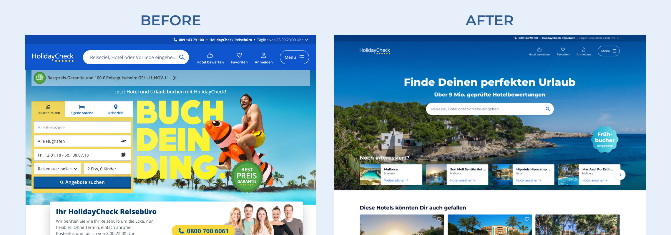
Simplifying search
Having learned that existing search sent users to the offer list too early (where they exited) and that most users on home wanted to learn more about the hotel or the destination, the first decision was to simplify search.
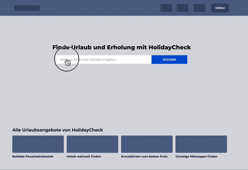
Initial concept shows a single search field, with additional filters appearing conditionally. For example, a user who would enter a hotel name, and was more likely to just look for reviews, would be taken directly to the hotel page. A user looking for a destination, would be given the option to enter further information to see a list of hotels available. This concept was accepted in "sanity check" hallway tests.
For the first MVP we decided only to show a single search field, which allowed us to go live and gather real world data faster. Lack of additional filters did not significantly impact our conversion, and we proceeded to experiment on different concepts of presenting them to users, to see if we could further improve performance.
Basic filters with pre-set values: concept was described in user tests as clear and familiar, but unexciting.

Conversational search filters, where users would enter their criteria answering one question per screen. It elicited a very positive emotional user response, but the concept generated a number of usability issues and edge cases.

Search filters in a conditional overlay, an approach that sought to marry the familiarity of basic filters, with the delight of the conversational prototype. It performed well in tests, but users saw no advantage over setting filters a step later on hotel list. It led us to think hotel list might be the better place to eventually focus on improving search filters.

COVID-19 stopped further investigation into search as traffic decreased, and we had to redirect design efforts.